

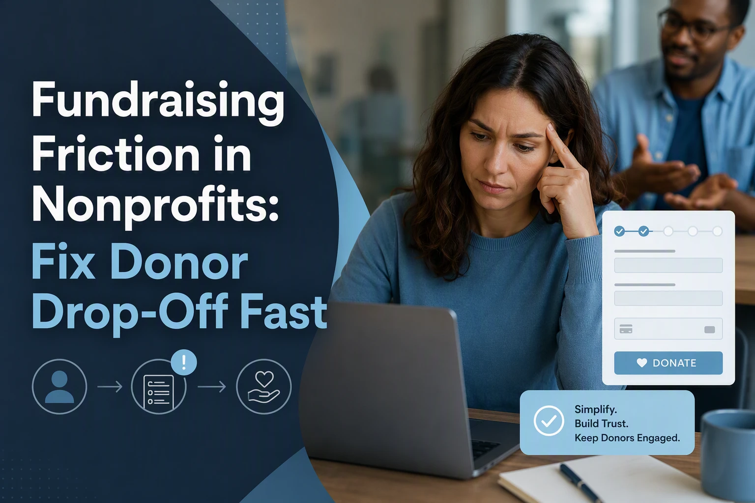
Quick Summary: Donor drop-off often results from friction points like complicated checkout, mobile issues, or unclear impact, not disinterest. Fixing these involves simplifying forms, making fees transparent, and designing for mobile speed. Using behavioral insights like clear defaults and impact-focused messaging can lower psychological barriers and boost retention, especially for first-time donors.
A first-time donor taps your Giving Tuesday email, lands on mobile, hits the payment screen, sees a surprise fee prompt, and leaves. That is not low intent. It is friction. This guide shows how to spot the real Fundraising Obstacles behind drop-off and fix them fast with practical Donor Retention Strategies and Donor Engagement Tips. It draws on proven Donor Retention Strategies from donor journey, conversion, and behavior work nonprofits use every day.
Step 1: Pinpoint where donors are dropping off
Start with your funnel, not your opinions. Track where donors quit by device and by step. M+R Benchmarks 2026 shows mobile drives 52% of nonprofit website traffic, but only 43% of donation transactions. That gap often signals friction on phone screens. For sharp Donor Retention Strategies, map each step: landing page, amount select, form fill, payment, confirmation.

Read the pattern before changing the page. If exits spike at payment, test wallets. If they spike at form fill, cut fields. Use a quick table:
| Segment | Drop point | Likely issue |
|---|---|---|
| Mobile | Form fill | Too much typing |
| Desktop | Payment | Trust or payment choice |
Fix the biggest leak first, then retest.
Step 2: Remove the friction donors feel most at checkout
Checkout friction feels small, but it kills intent fast. The fix is simple: ask for less, explain costs clearly, and make mobile completion easy.
- Cut unnecessary fields and extra steps
- Remove phone, title, employer, and “how did you hear about us?”
- Baymard found the average checkout has 11.3 fields, though many sites need far fewer, and 17% of users abandon because checkout feels too complex, according to Baymard research.

- Make fees, tips, and payment options transparent
- Show the final total before payment.
- Label fee coverage as optional.
- Keep payment choices clear, not crowded. Hidden surprises create doubt.
- Optimize for speed and mobile-first completion
- Use large tap targets and a single-column form.
- Save progress if a donor gets interrupted.
- Mobile friction matters because many online gifts now happen on phones.
Also Read: 3 Tips for Winning the Attention Economy in Nonprofit Campaigns – Cherian Koshy
Step 3: Use behavioral design to lower psychological resistance
People quit when giving feels hard, vague, or risky.
- Reduce choice overload with clearer defaults: Show one suggested monthly amount, one one-time option, and one clear next step. Defaults can lift action, though low default amounts can also anchor gifts down, as shown in research on charitable donation defaults.
- Lead with impact, not abstract organization language: Start with what the gift does now. Say “$25 funds two meals tonight,” not “support our mission.” Concrete outcomes cut doubt and help donors picture the result.
- Reinforce trust and reciprocity after the gift: Thank fast, confirm impact, and show what happens next. Trust has a positive link with giving in this meta-analysis on charitable trust.
Step 4: Turn the fix into a retention system
Treat the first gift as the start of the relationship
Your fix is not done at checkout. Build a short welcome path for every new donor. AFP notes first-time donor retention stays painfully low, around 19% in sector data from its 2026 summary AFP retention analysis.
- Send thanks fast
- Show one clear impact
- Ask one small next action
The second gift matters more than a fancy thank-you.
Strengthen recurring giving without adding pressure
Make recurring giving easy, visible, and optional. Donors who stay give more often and more generously, according to the 2026 benchmark report.
| Do | Avoid |
|---|---|
| Offer monthly as a choice | Guilt-heavy upgrade copy |
| Explain value simply | Pop-ups that block checkout |
Measure one change at a time
Do not change five things and hope. Test one fix, then watch:
- form completion
- first-to-second gift rate
- recurring opt-in rate
Small wins stack when you can trace cause and effect.
If donor drop-off keeps draining revenue, get expert help from Cherian Koshy to remove friction, rebuild trust, and lift conversions fast.
Frequently Asked Questions
Q1: What are key strategies nonprofits can implement to reduce donor drop-off during the fundraising journey?
Cut steps, trim fields, show impact fast, add trust cues, offer payment choice, and fix mobile pain points. Track exits by page so you solve the biggest leaks first.
Q2: How can behavioral science insights help nonprofits remove psychological barriers to giving?
Use clear defaults, low mental effort, social proof, and specific impact language. Cherian Koshy often stresses that trust, clarity, and emotional safety shape giving more than design polish alone.
Q3: What are common friction points in online donation processes and how can they be fixed?
Common issues include forced account creation, slow pages, surprise fees, weak error messages, and too many choices. Fix them with guest checkout, faster load time, smarter forms, and simpler ask arrays.
Conclusion
Donor drop-off is usually a fixable friction leak, not donor disinterest. Focus on fewer fields, clearer impact, faster pages, and better mobile checkout. Since mobile drives 52% of nonprofit website traffic, small experience fixes can protect more gifts and improve retention.


